
Visual Brand Identity: Wise Mind Way
Visual brand identity case study for Wise Mind Way LLC, the therapy practice of Ilene Marto Atiyah, LCSW-C. Ilene Atiyah and Wise Mind Way are licensed to practice in DC, MD, VA and NY.

Brand Brief : Wise Mind Way
the ask
Ilene Marto Atiyah, LSCW-C came to me asking to help her set up her new therapy practice. She would be working privately for the first time and wasn’t sure what the practice would be named, so we included a naming exercise round in her package.
the kickoff
We started with a Discovery Call where we discussed what wasn’t working about their current branding (everything!) and where they’d be using their new branding (everywhere!). They had no real preference on color or type but they did really like the classic iconography of pizza boxes with a cartoon on them.
I put together a brand board for approval, drawing on cakes and pastries themselves for inspiration as well as some classic iconography like the illustrated pizza boxes, I Love Lucy, ruffled gowns, and bold packaging and type examples. They approved it immediately and I got to work!

the process
At far right, you can see the exploration of color, type, and brand mark. From the beginning I knew that the cherry red and frosting pink were going to be essential to the color palette - and since I realized early on that Mindy and Ken themselves are the heart of why people love Mindy’s Bakeshop, it was an easy decision to make their own (adorable!) stylized faces the actual face of the brand.

Plus, Ken now has a mustache so I had to make his pizza box dreams come to life!


THE final round
Once the concept was decided, I quickly found that I could use two simple repeating shapes to create the icon: a circle, like a cookie, and a single curved scallop - like the frosting dollops on a decorated cake, or a paper doily you might get at a pastry shop. The final result is the hero icon of Mindy & Ken. Paired with the frosting-inspired color palette and modern typography, their brand assets came together easily from there.


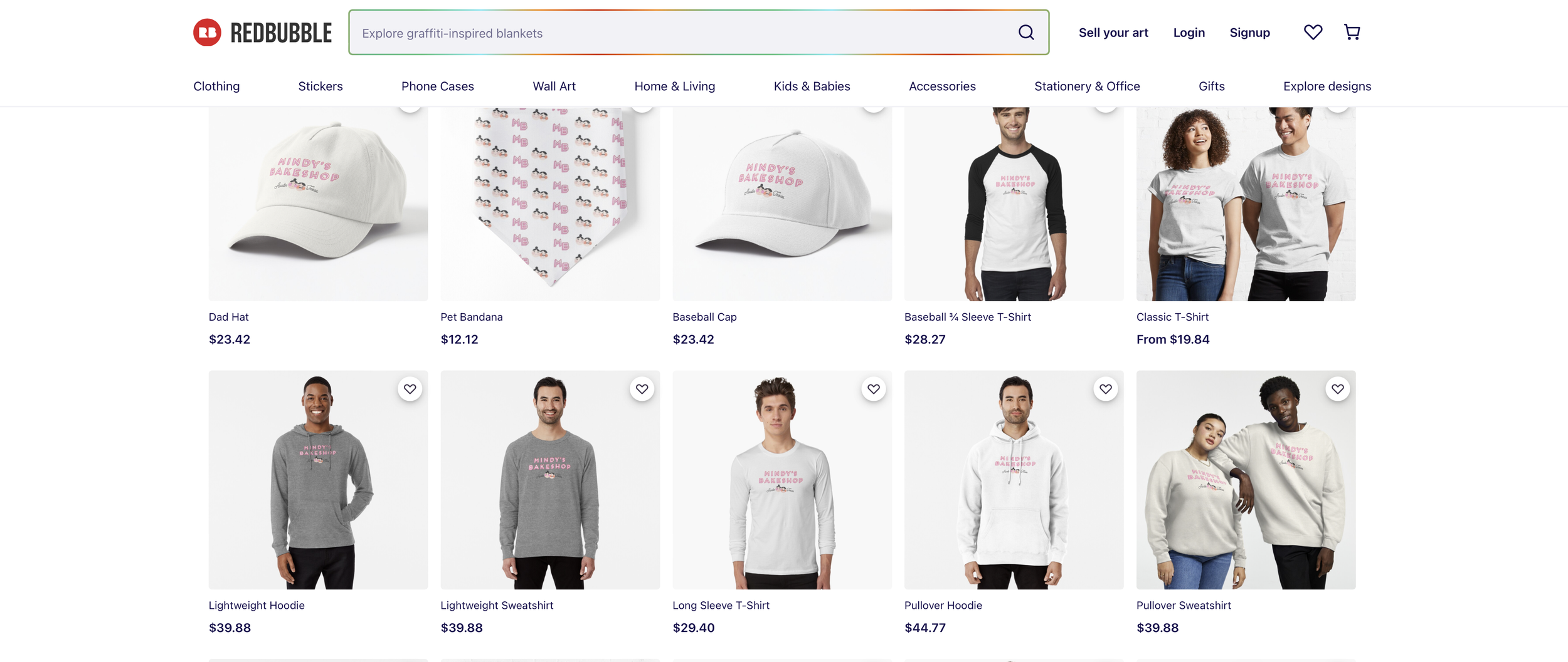
The scope of work included delivery of their wordmark, brand icon, various lockups on scallop background and circles (perfect for stickers for their bakery boxes!), typography selections, a color palette, and a few printables for their DIY cookie kits.
and here is the brand in action


here’s what mindy & ken had to say…

““HELLO GOOD MORNING I’M CRYING!
Jess, this is amazing!! The little faces! We’re OBSESSED... We have zero notes, just praise and excitement.
Thank you thank you thank you!!!”
”
