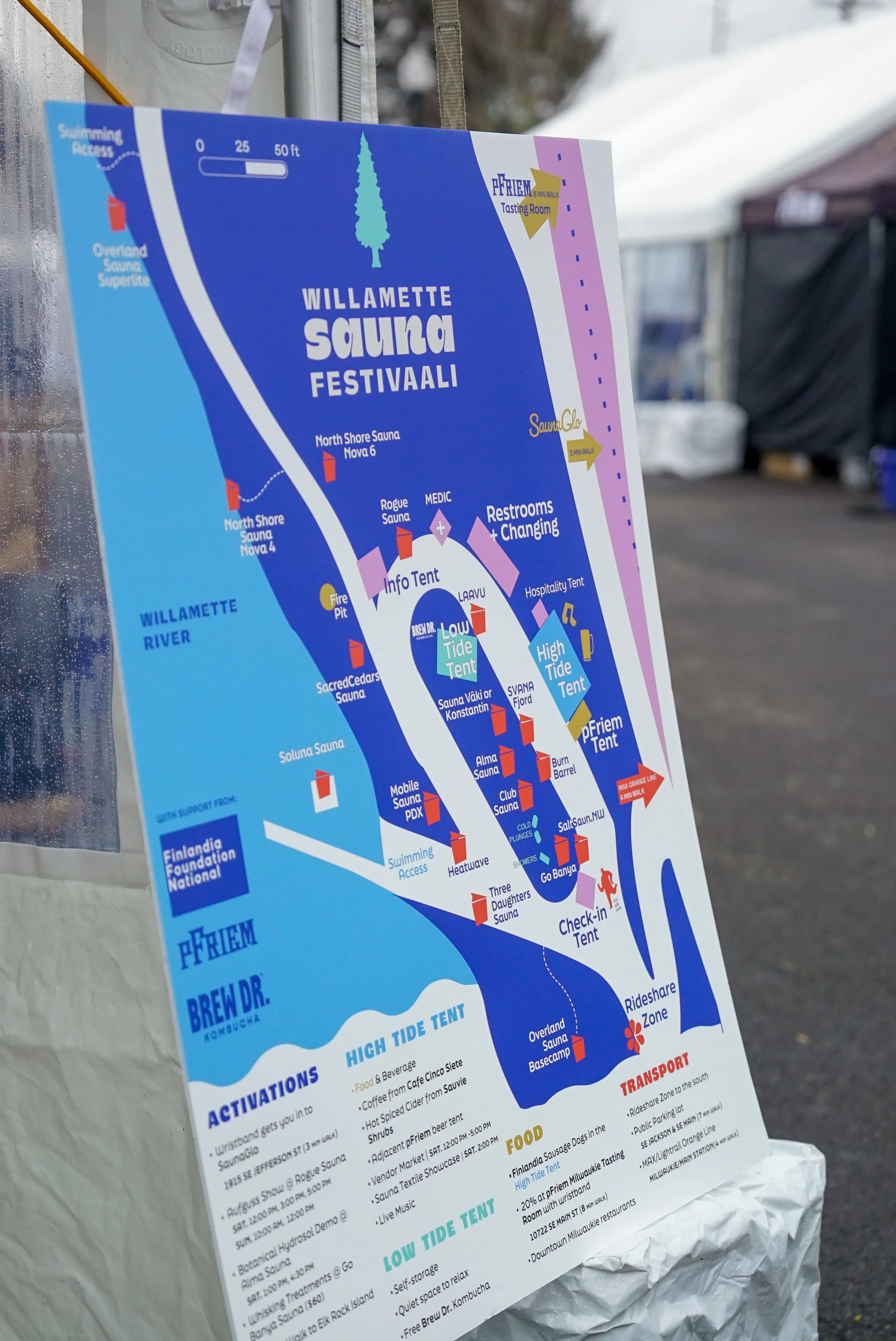
Visual Brand Identity: Willamette Sauna Festivaali
Background, process, and execution of the visual brand identity, marketing campaign, and on-site signage for the Willamette Sauna Festivaali, Portland’s first ever sauna-centric festival.

Brand Brief: Willamette Sauna Festivaali
the ask
Michael and Katie Calcagno, owners and founders of SaunaGlo, came to me with an idea in late 2025: they were planning a first-to-market sauna festival in Milwaukie, OR and “needed help with a logo.”
I was able to recommend that what they actually needed was a full visual brand identity for this new opportunity that would need to scale across advertising & marketing efforts, become instantly recognizable on social media, translate to onsite signage and wayfinding, and branded merchandise. They brought me on as Creative Director and I got to work.
the kickoff
I pulled together a brand board for approval, making sure to provide context for the scale and environment the brand would occupy during the event. I drew on my years of wedding & event signage experience to be able to articulate the need for a defined but varied color palette, bold type, and clear iconography. Katie and Michael wanted to ensure the festival came across as a deeply human, community-minded endeavor - they requested nothing too polished or corporate feeling. I looked to Scandinavian patterns and vintage Woodstock posters for inspiration.
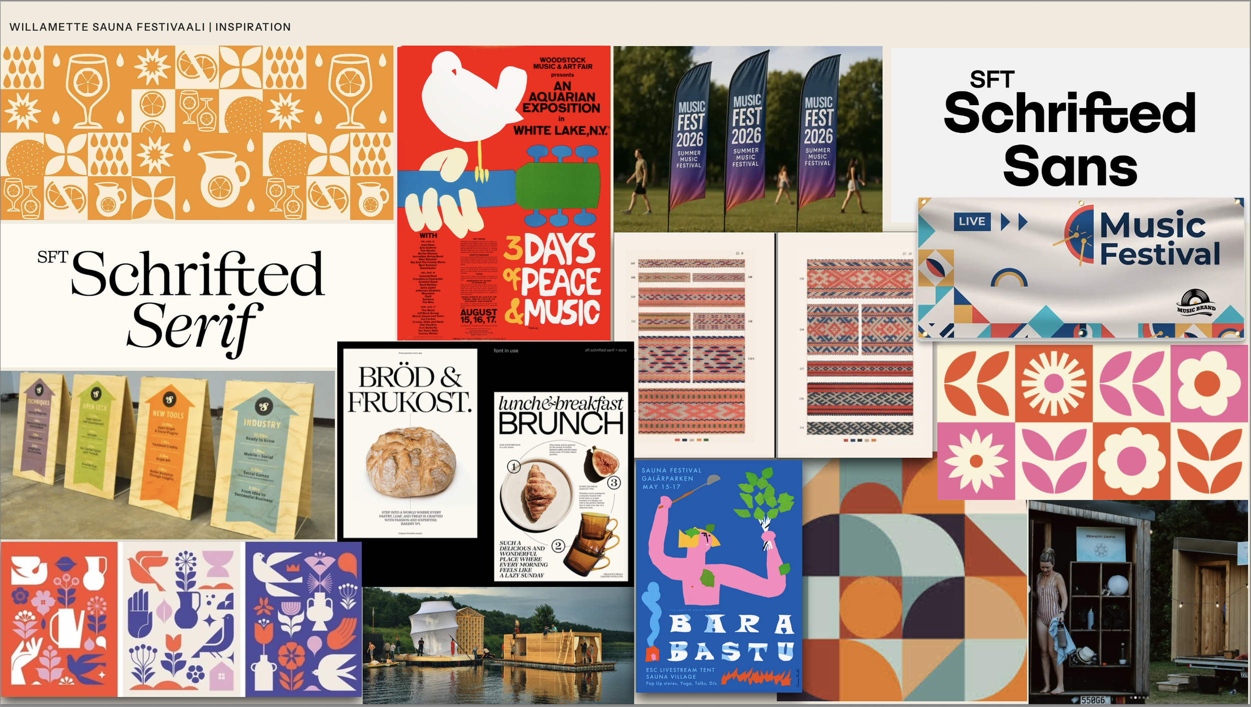
The visual brand direction I used to guide the creative process.
the process
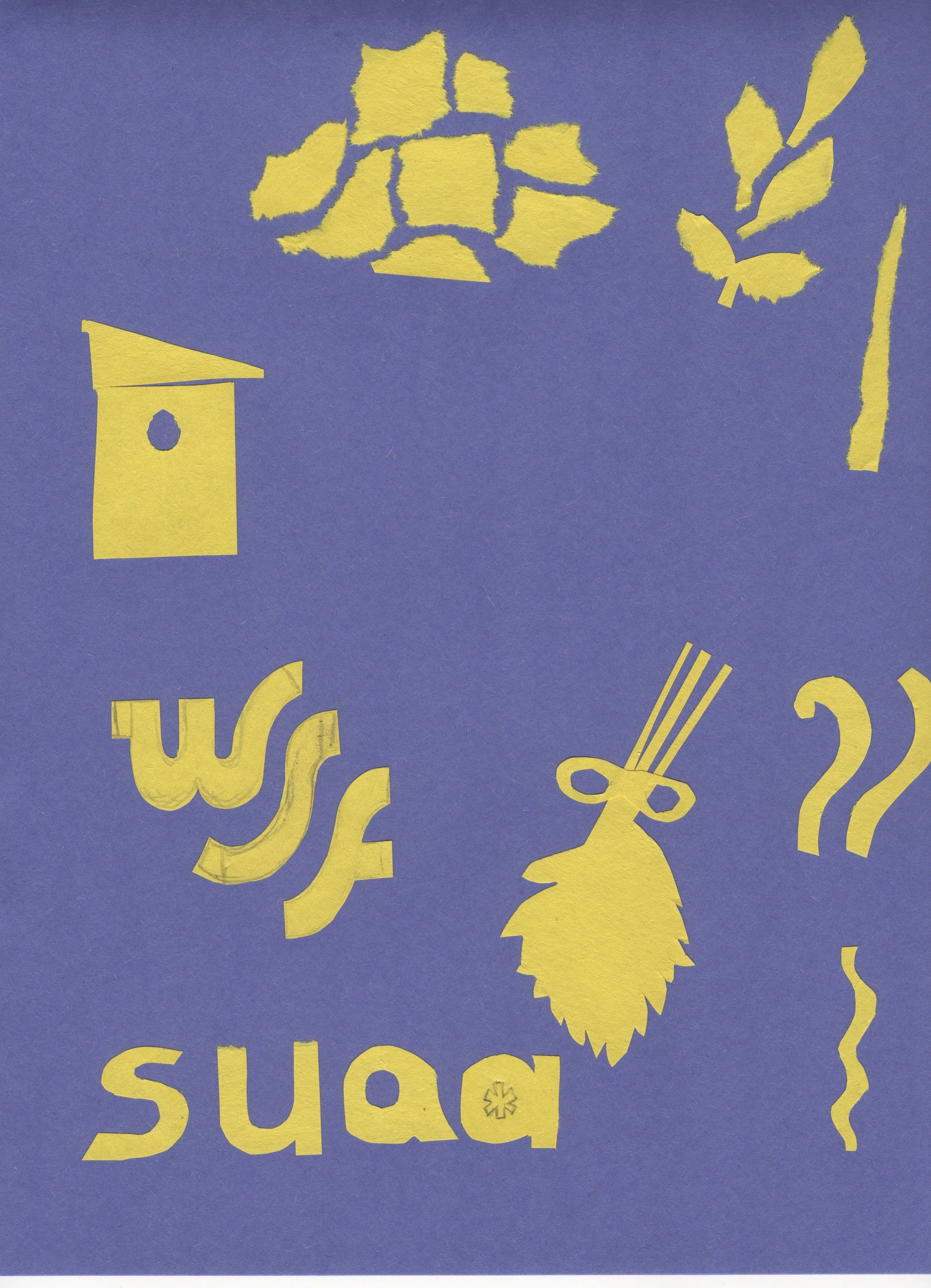
I began with handcut construction paper sauna-culture-related shapes to convey the imperfect, hand crafted feeling we wanted to achieve . Ultimately these experiments were scrapped, but the throughline is there even in the finished brand. I also played around with geometric quilt-square style iconography and a few soft typography sets that felt water-adjacent.
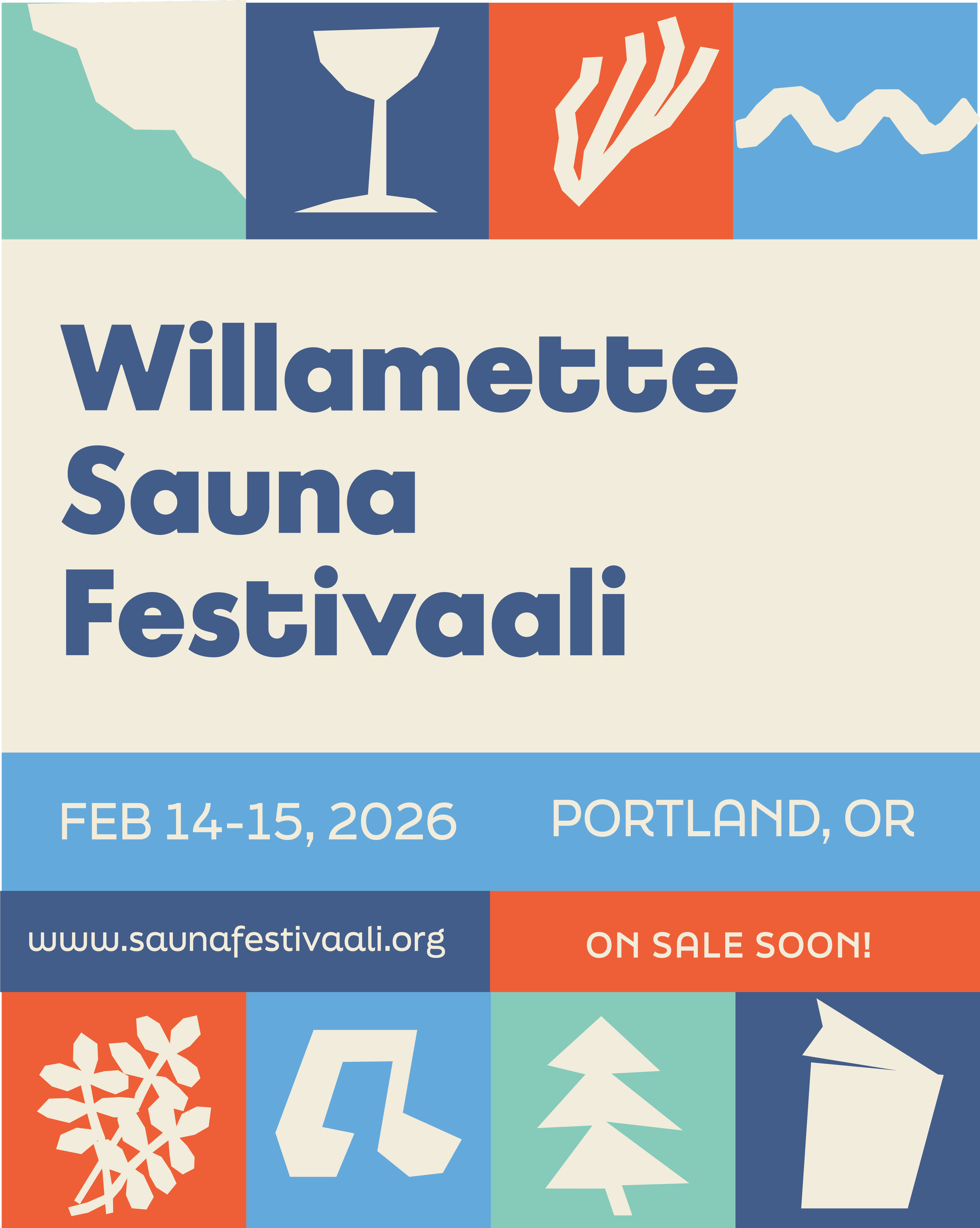

THE final round
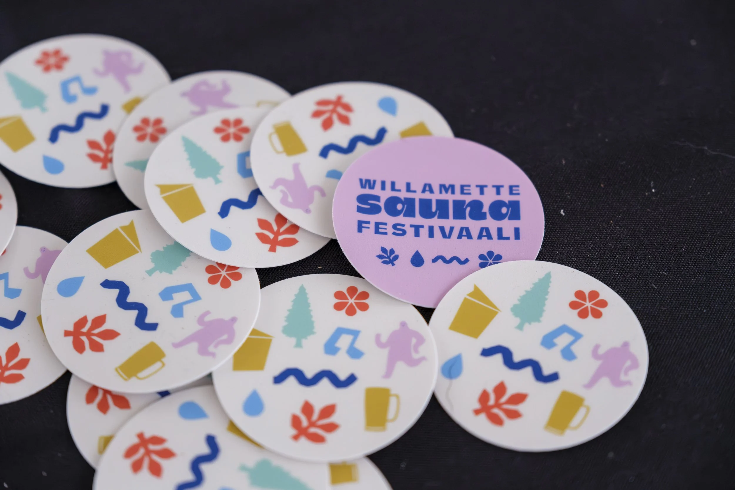
Once we settled on the icons (meant to loosely represent nature, heat, water, people, and the activities available at the fest) the wordmark came together by employing a mix of a big squishy, aquatic looking typeface from Brandon Nickerson with a more structured one. It worked in horizontal and vertical lockups, and felt “not corporate” enough to play well with the icons. The poster was the first thing that needed to get designed and everything else flowed from there
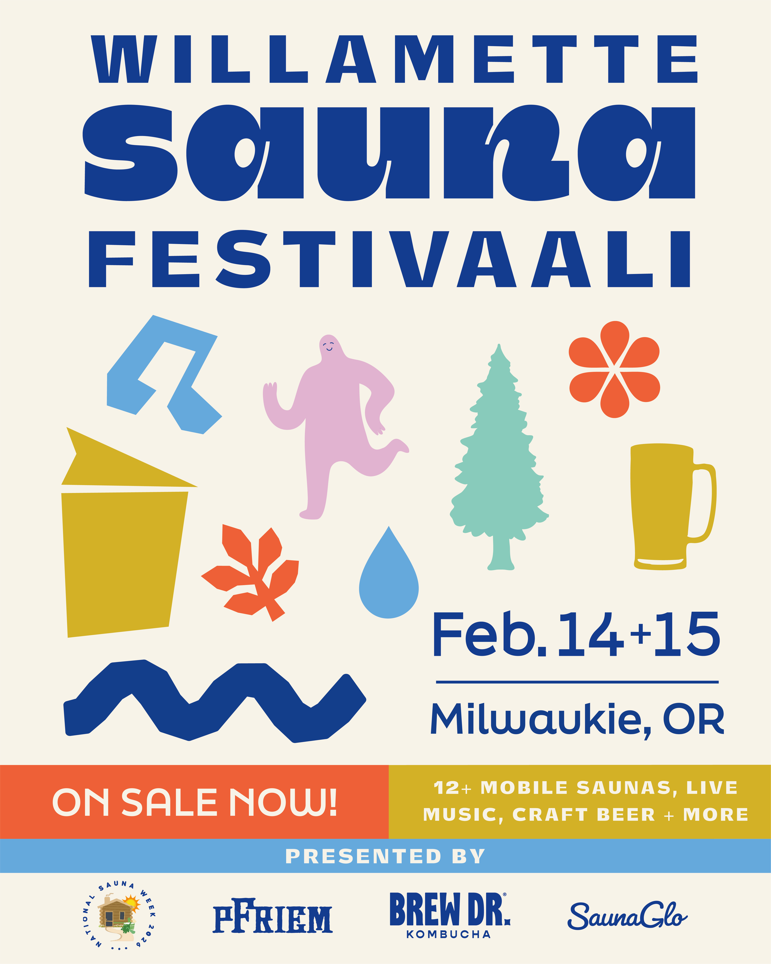









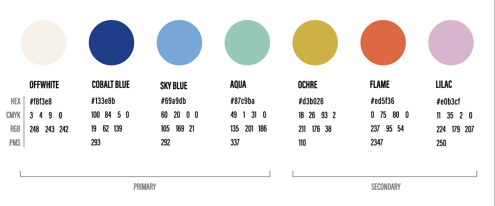
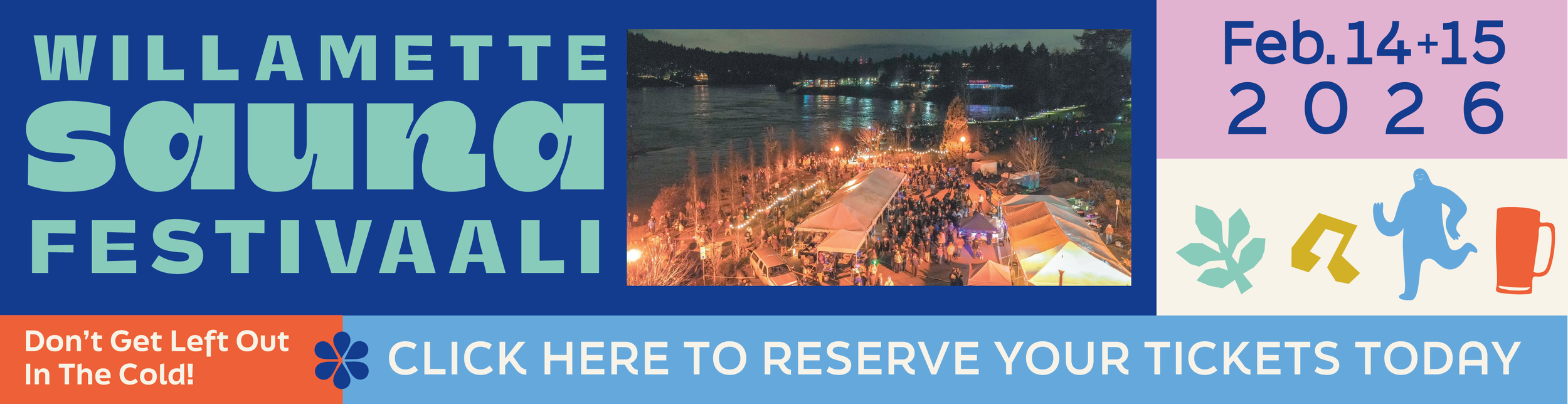
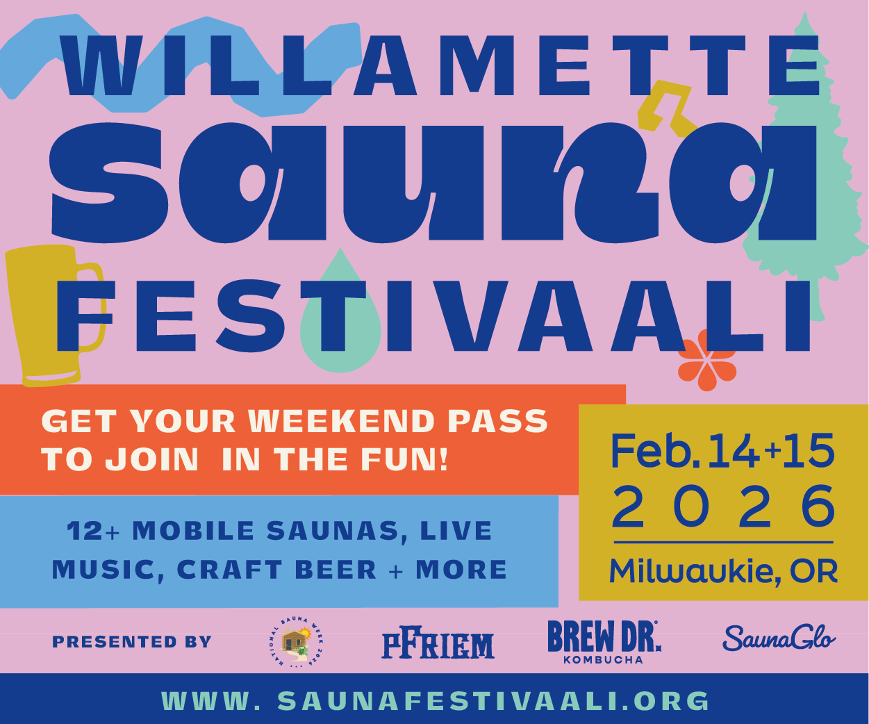
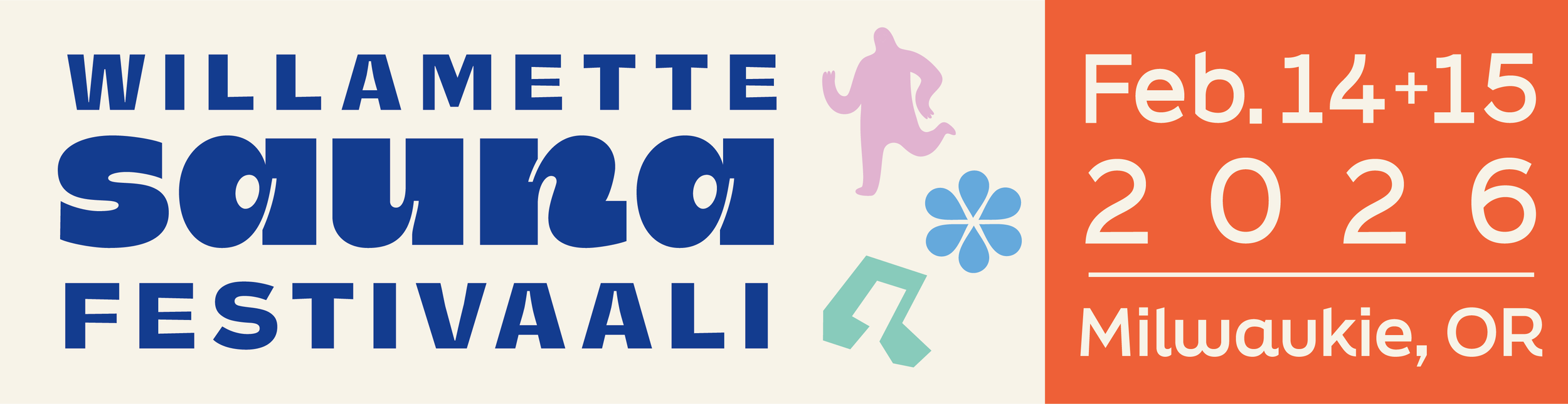
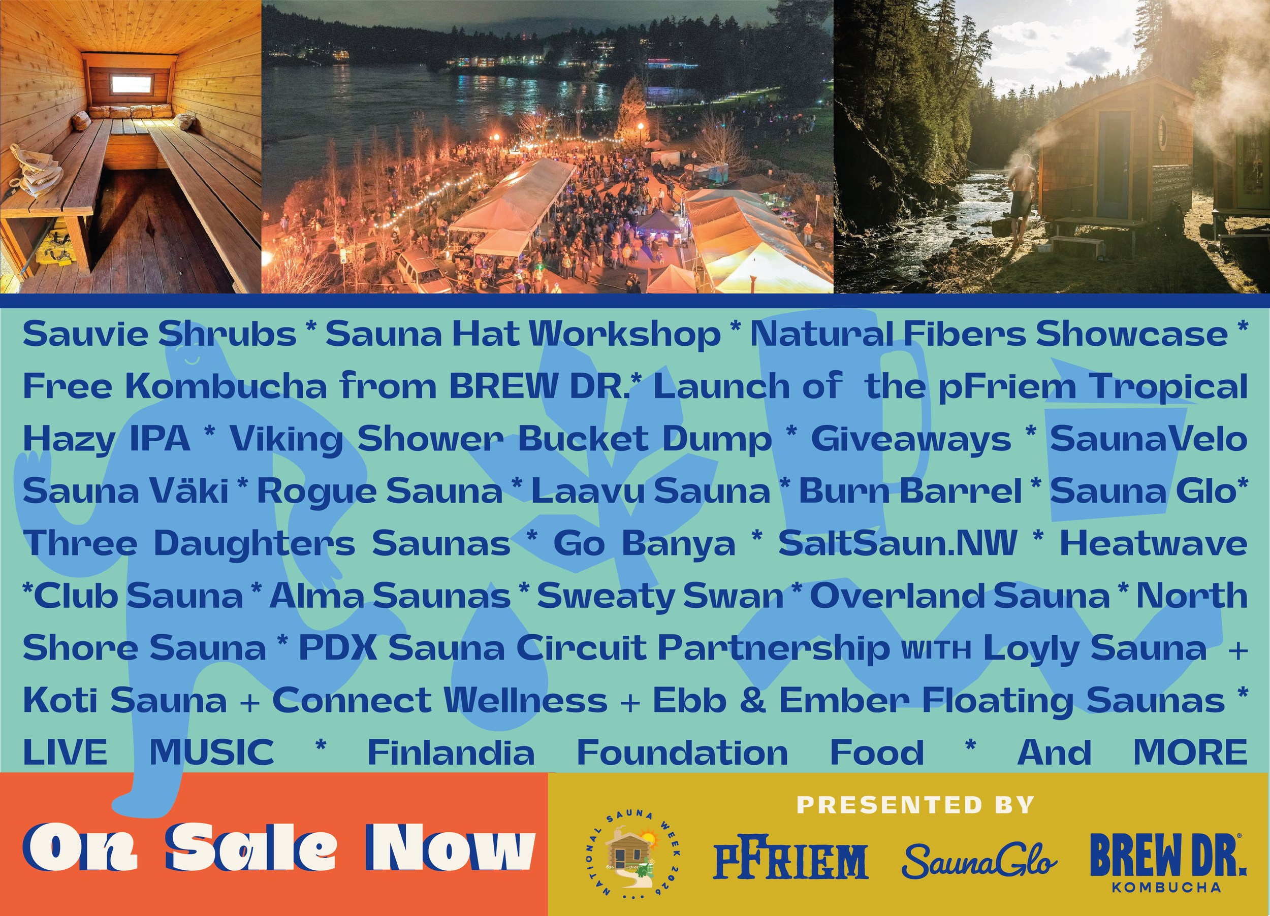
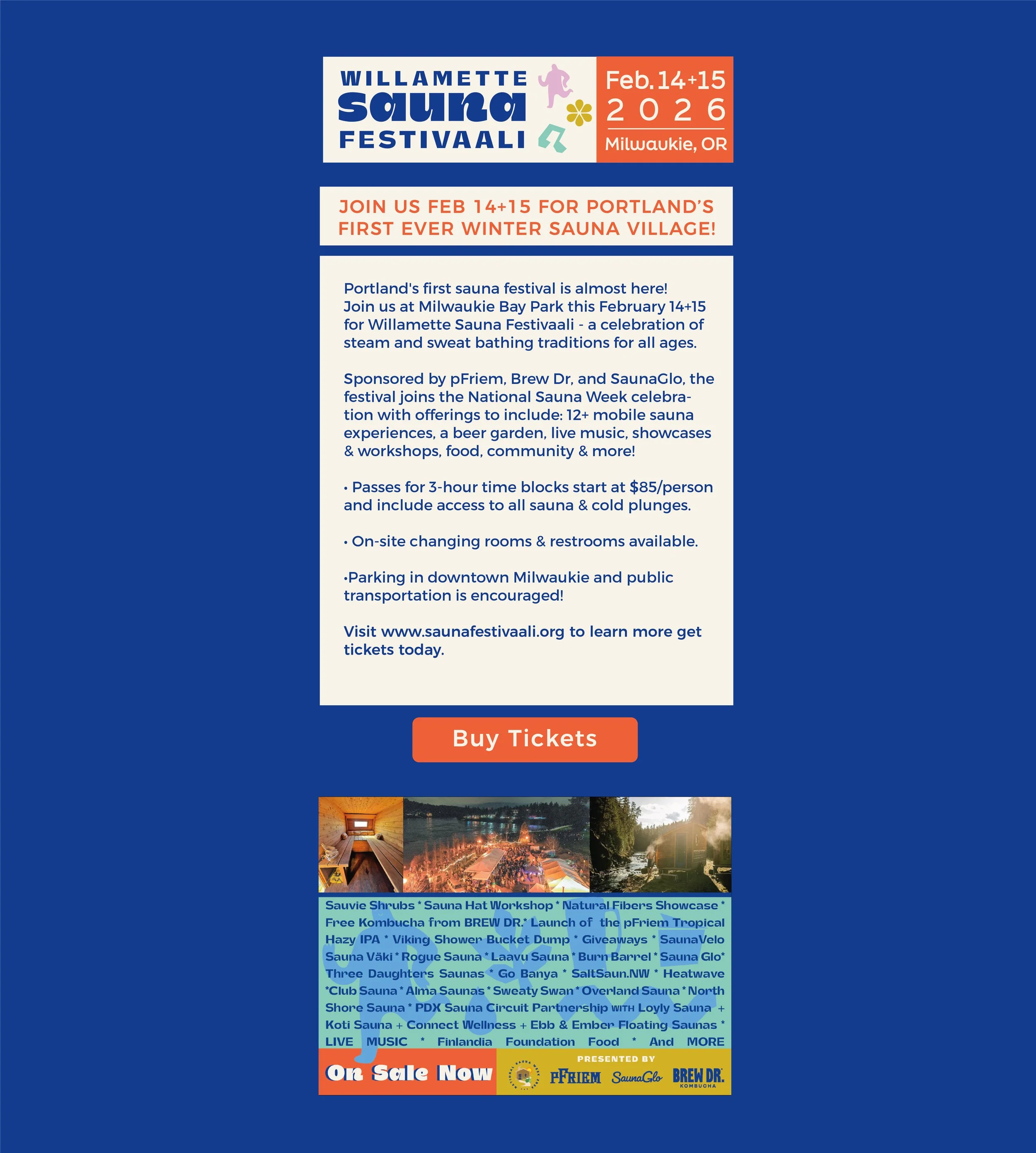
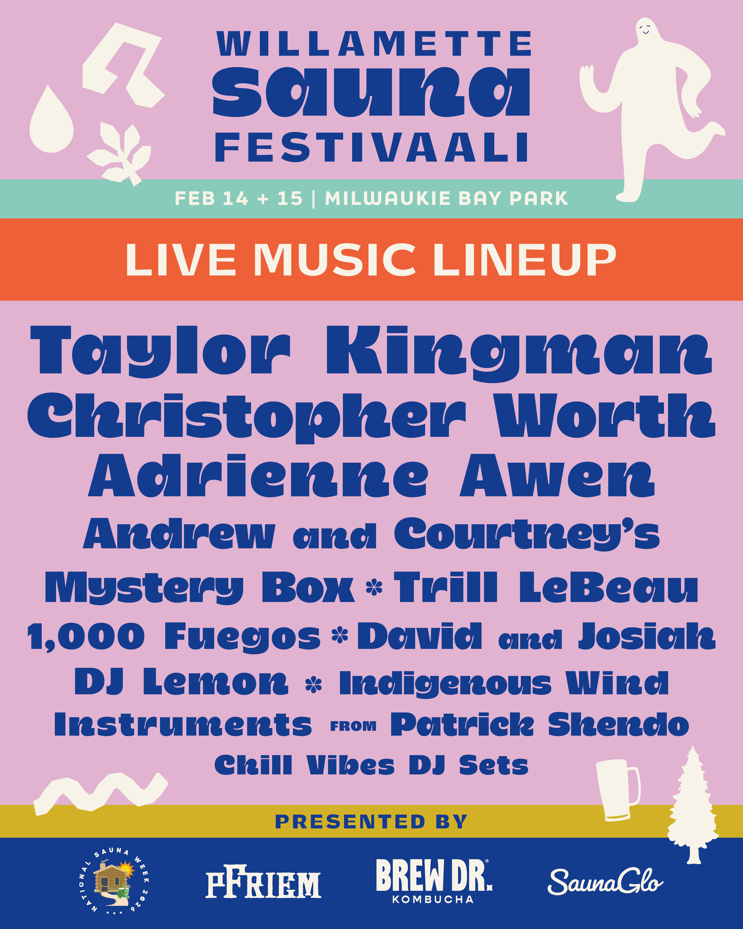
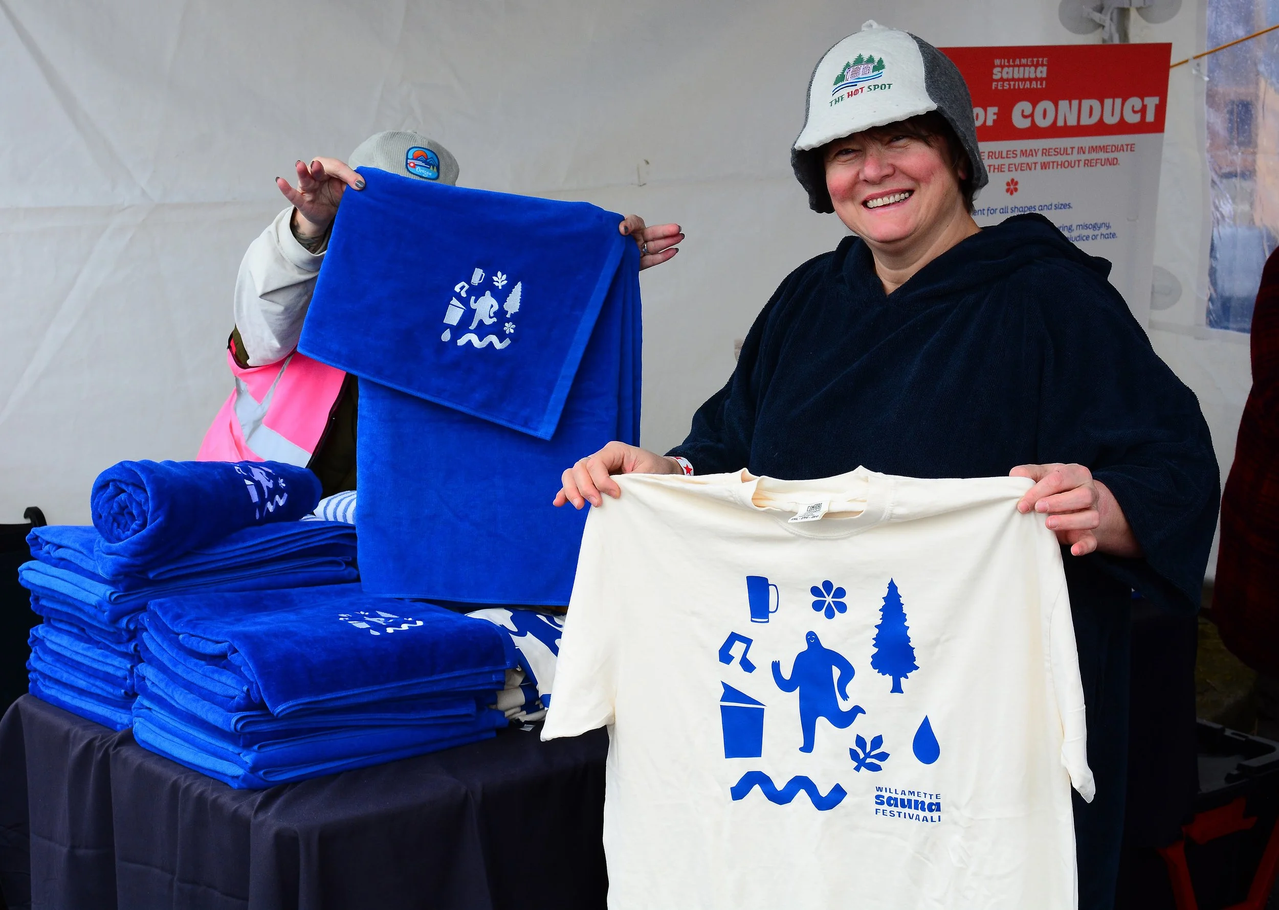
I rounded out the wordmark with a complementary typography set, a color palette, and deployed the icons in all the colors for maximum flexibility across all media. The ad campaign we ran across Meta, paper flyers, and local print sold out the event.
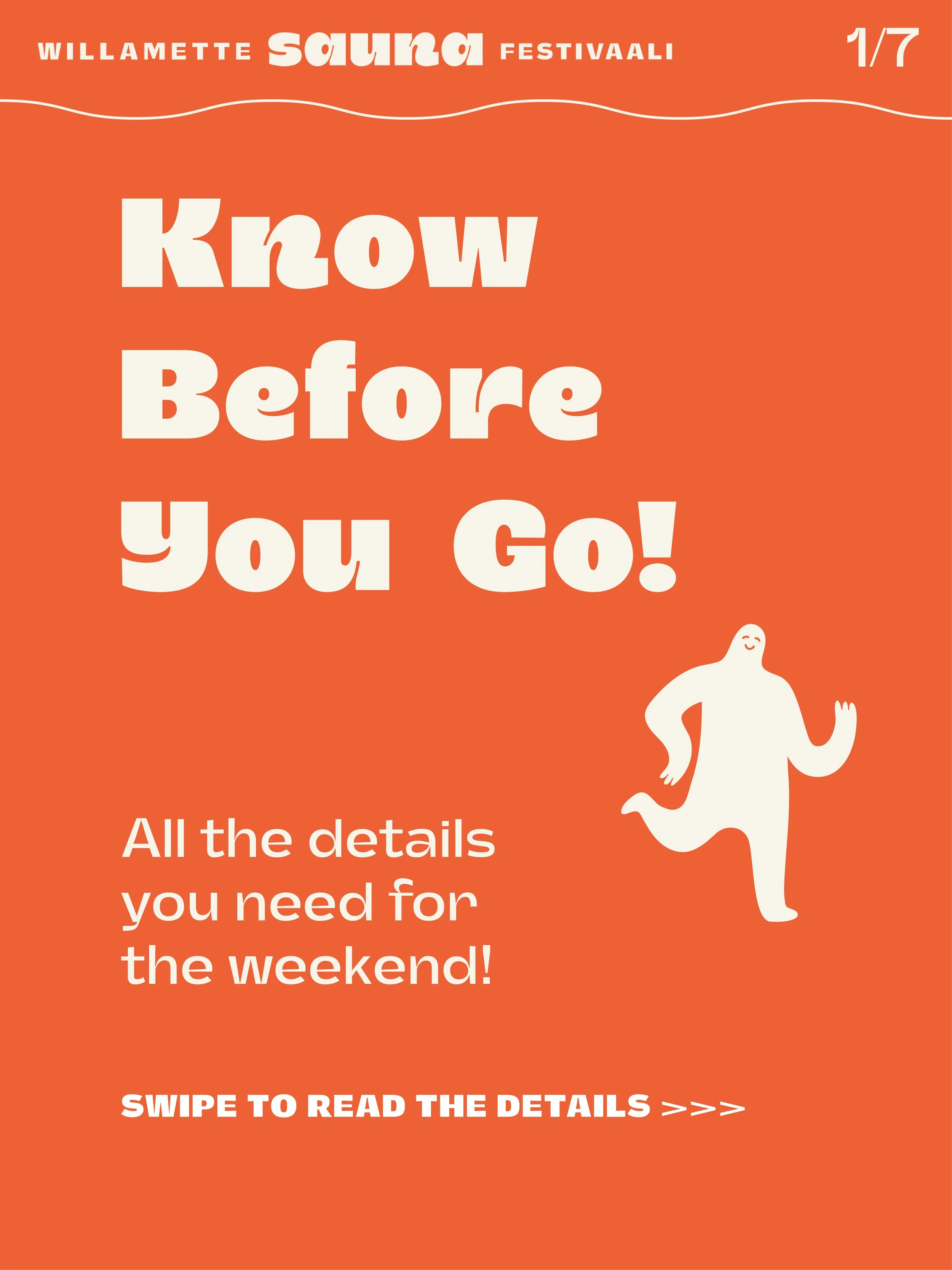
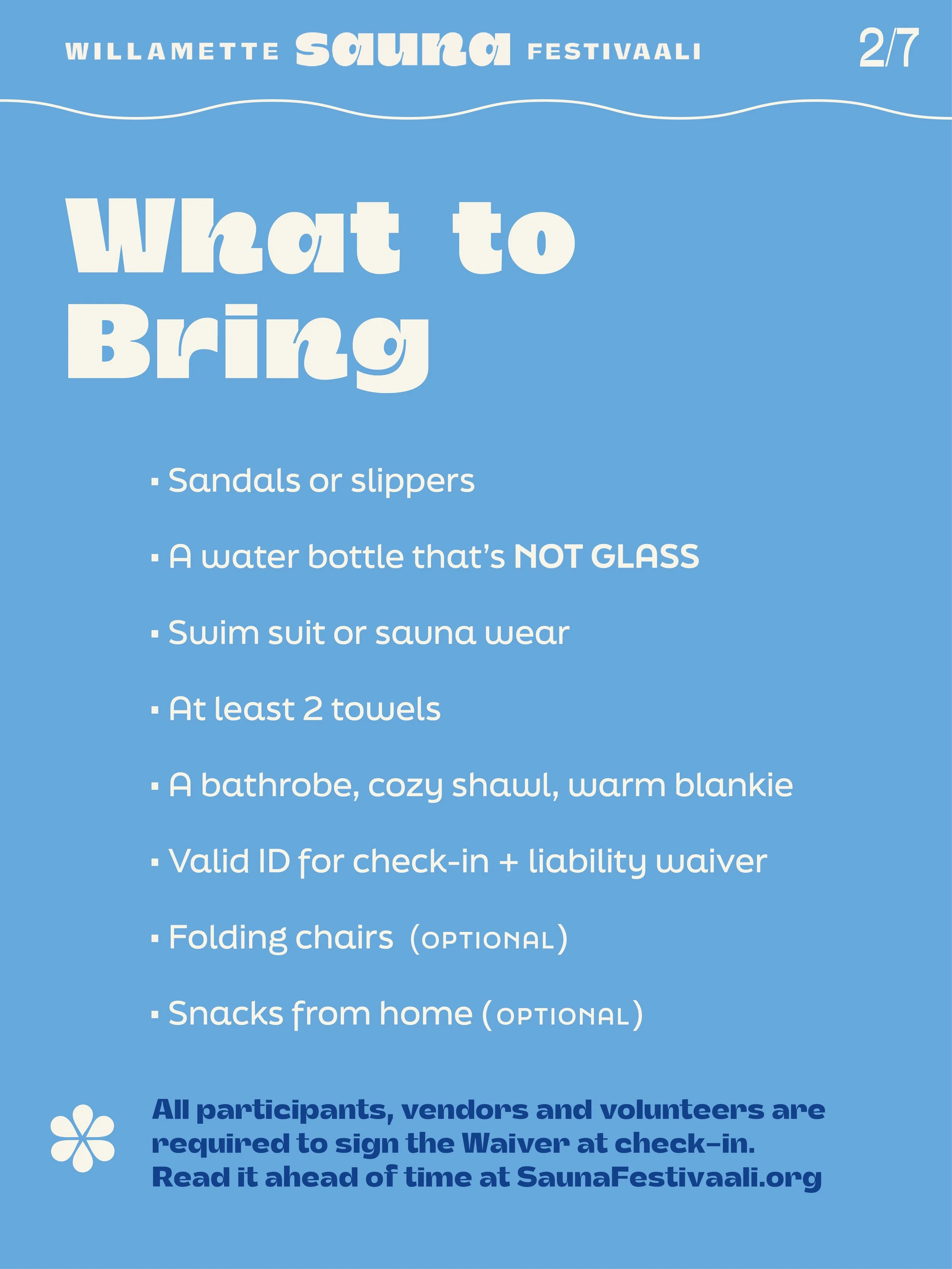
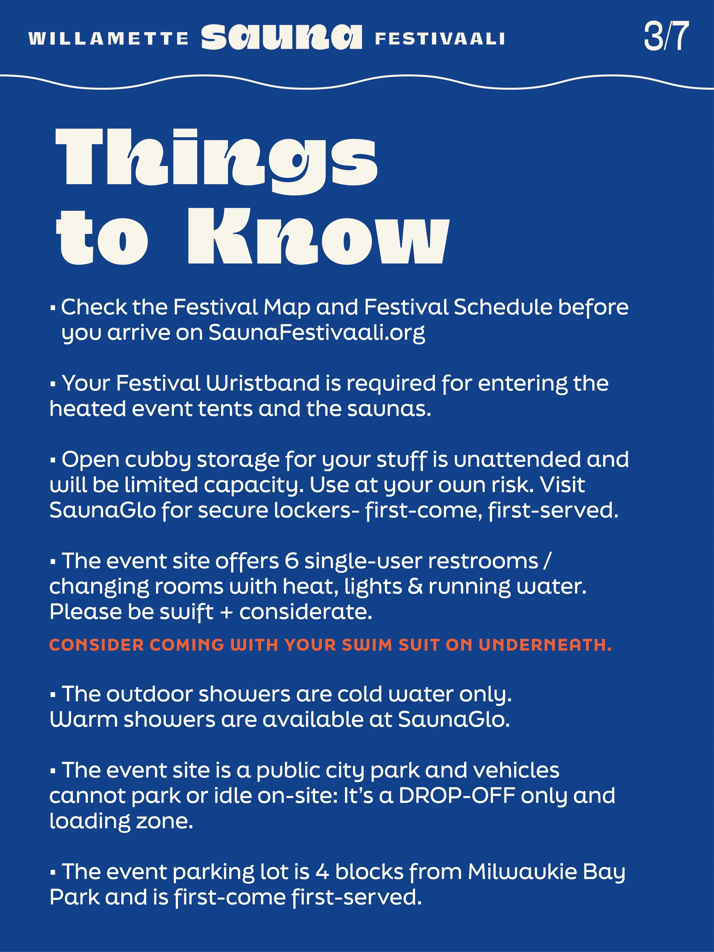
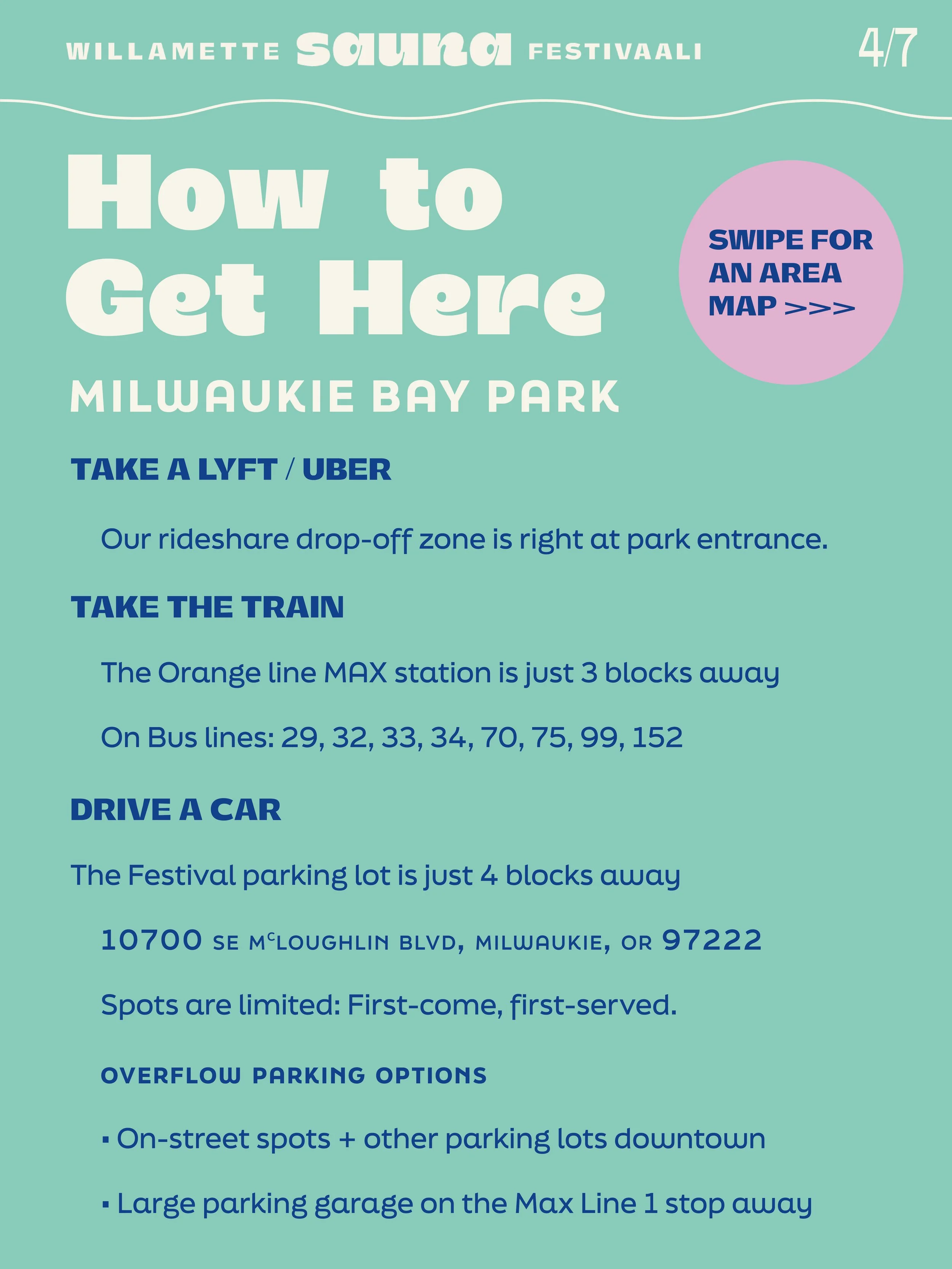
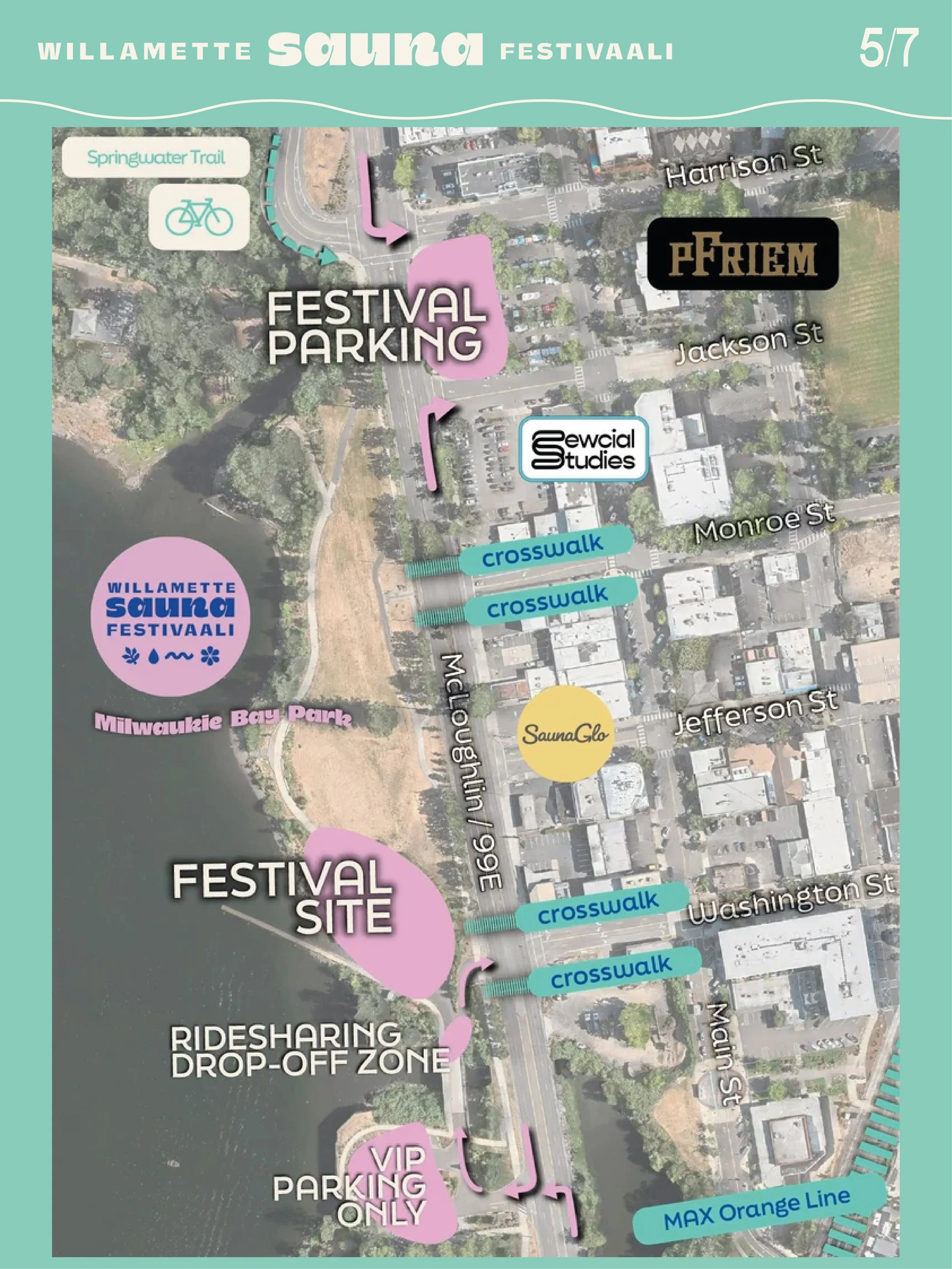
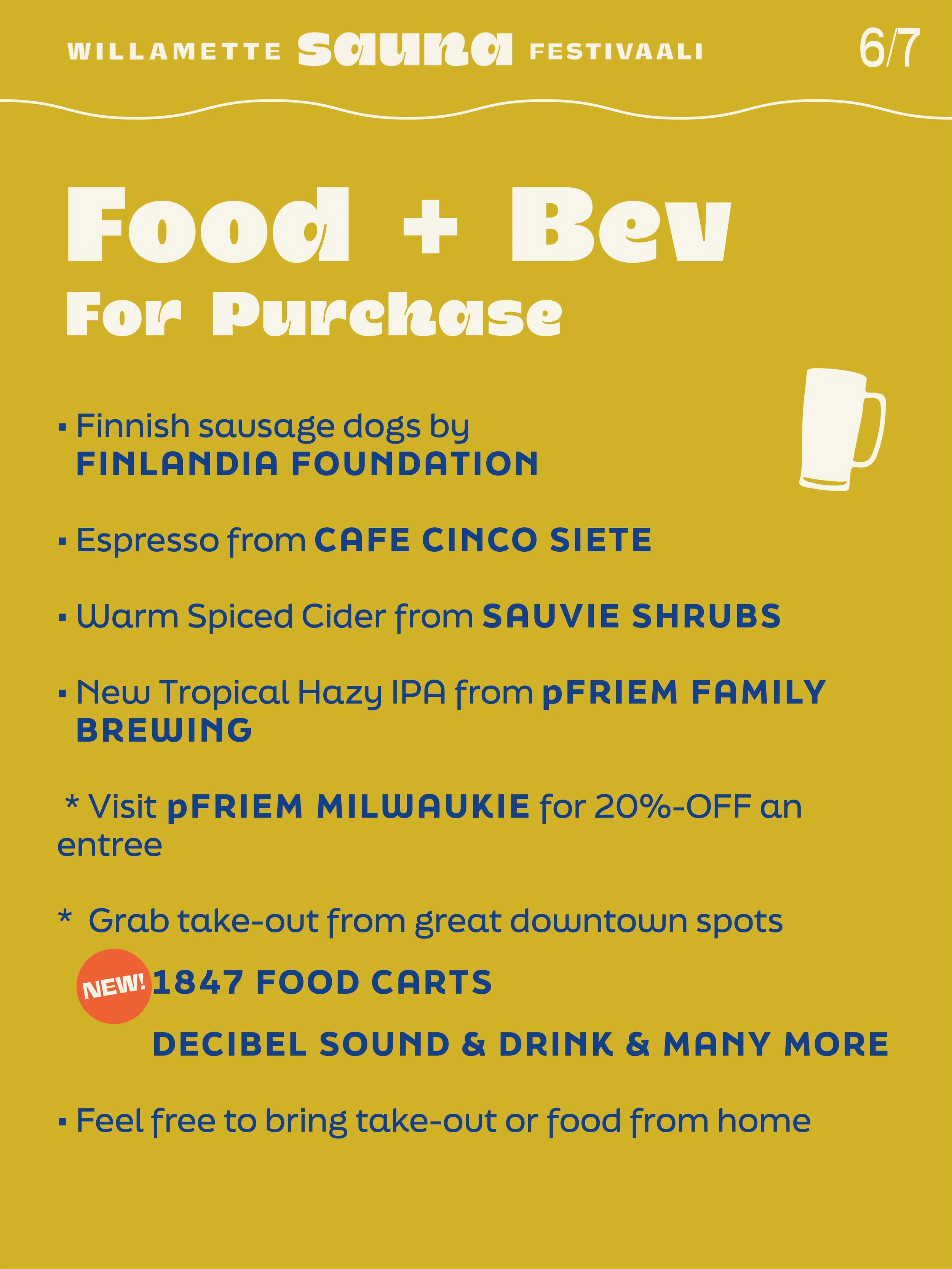
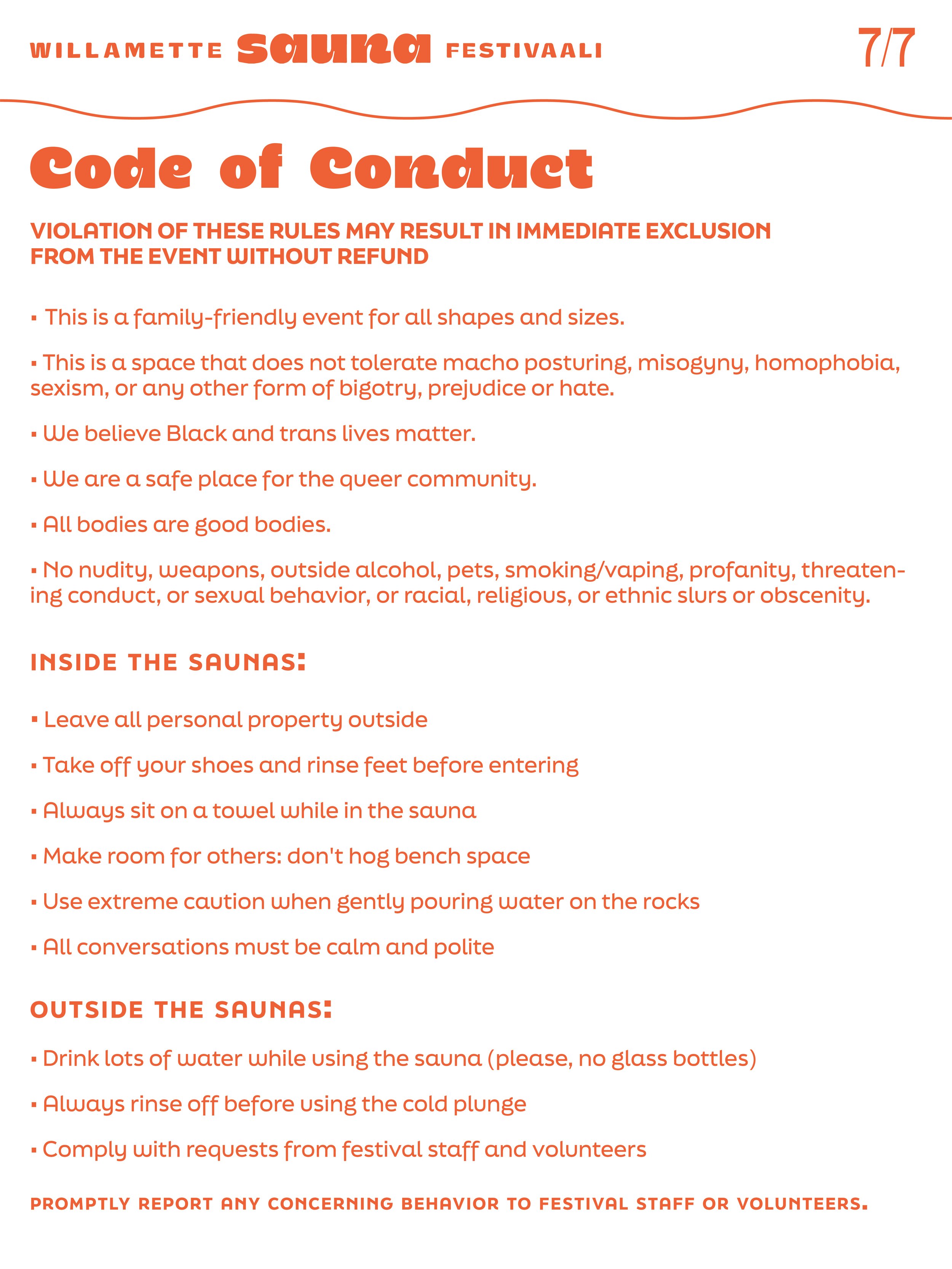
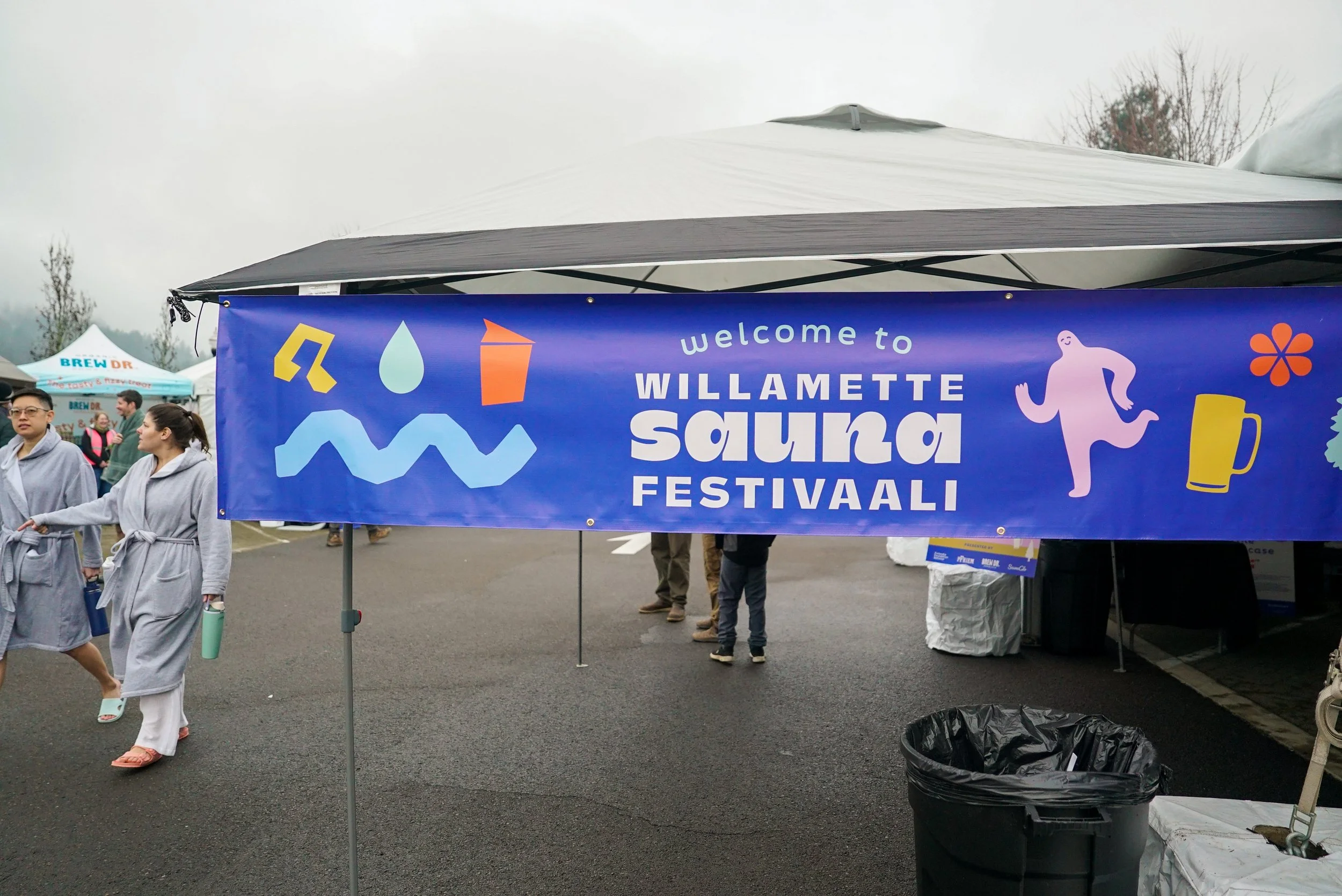
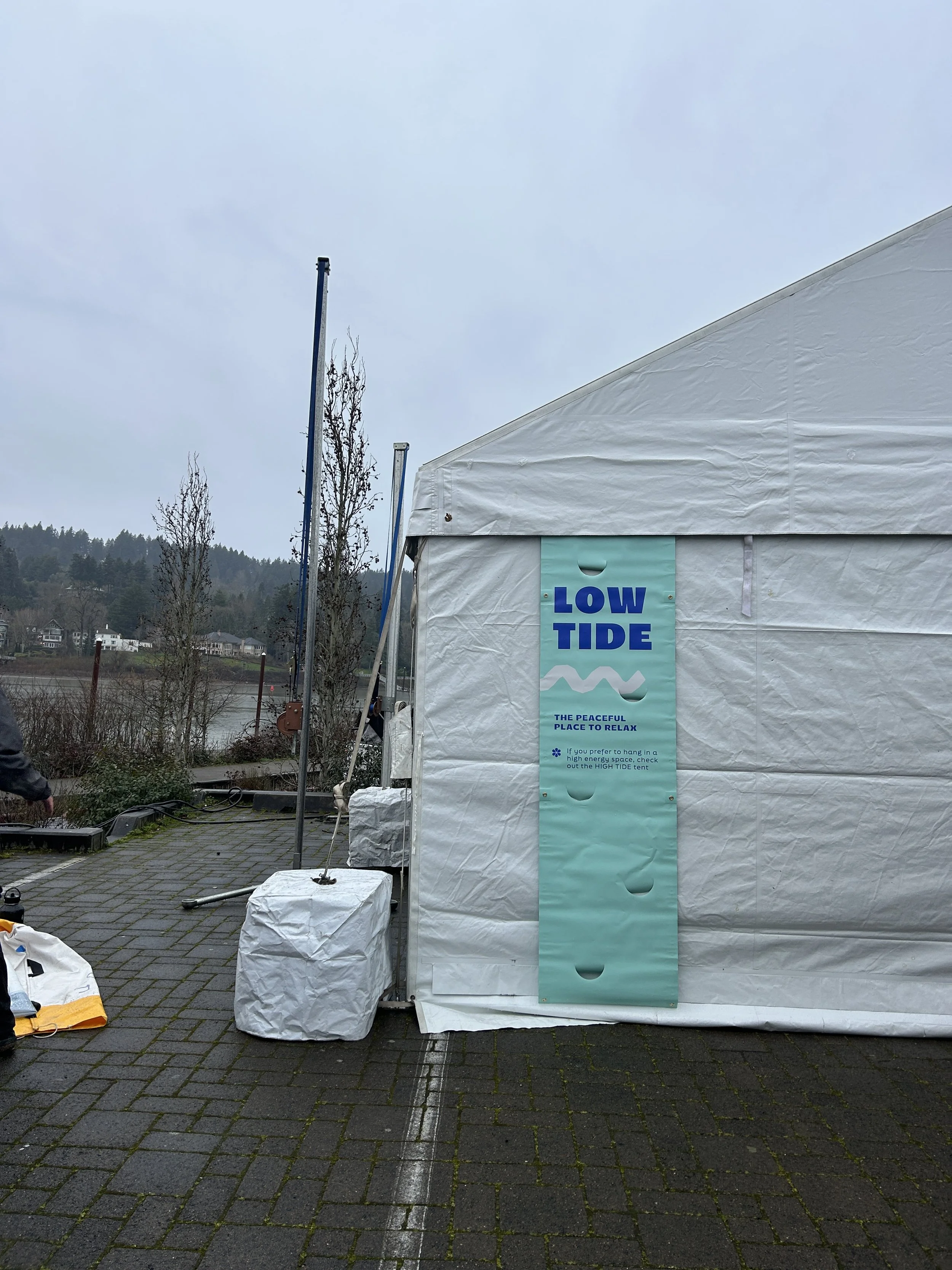
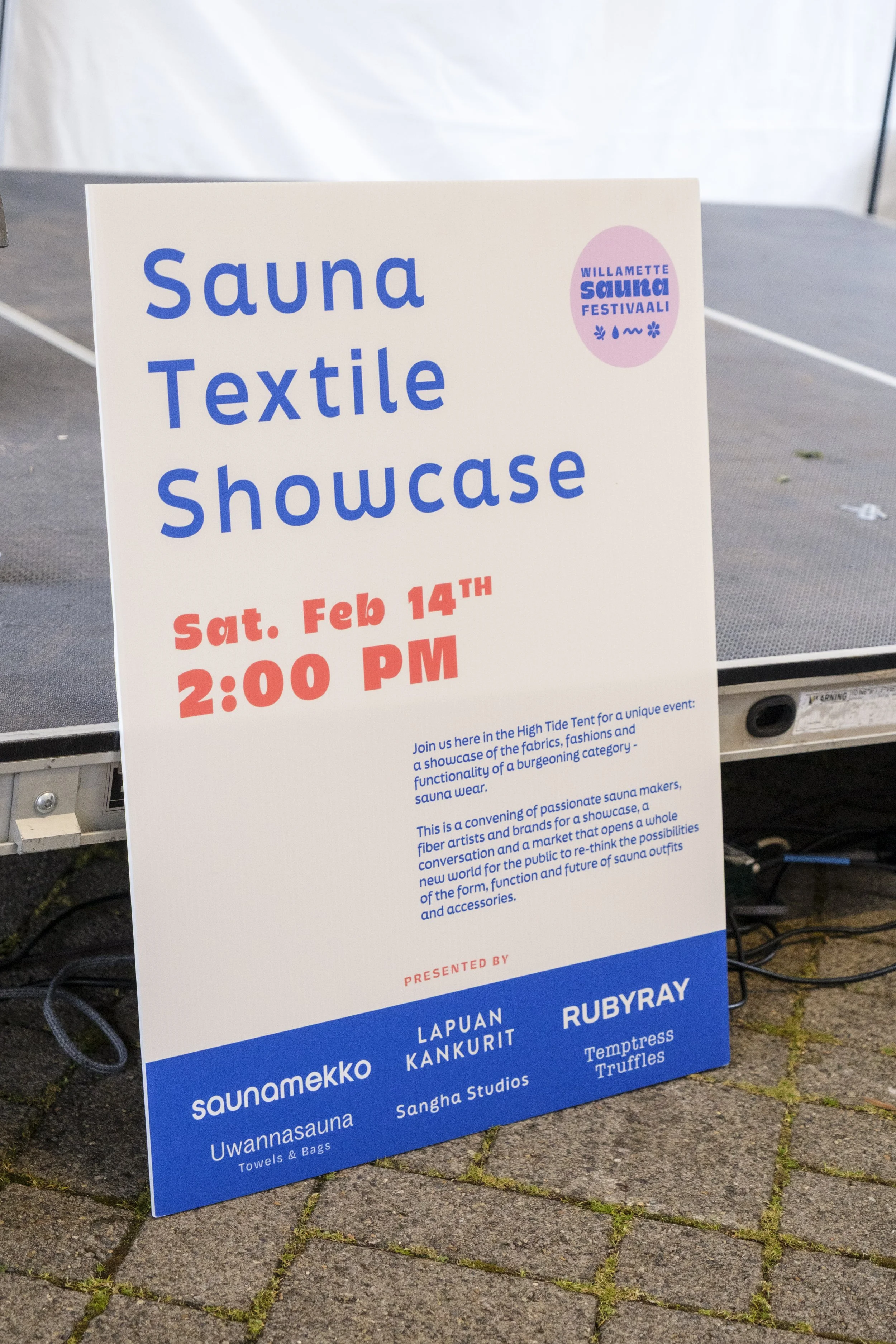
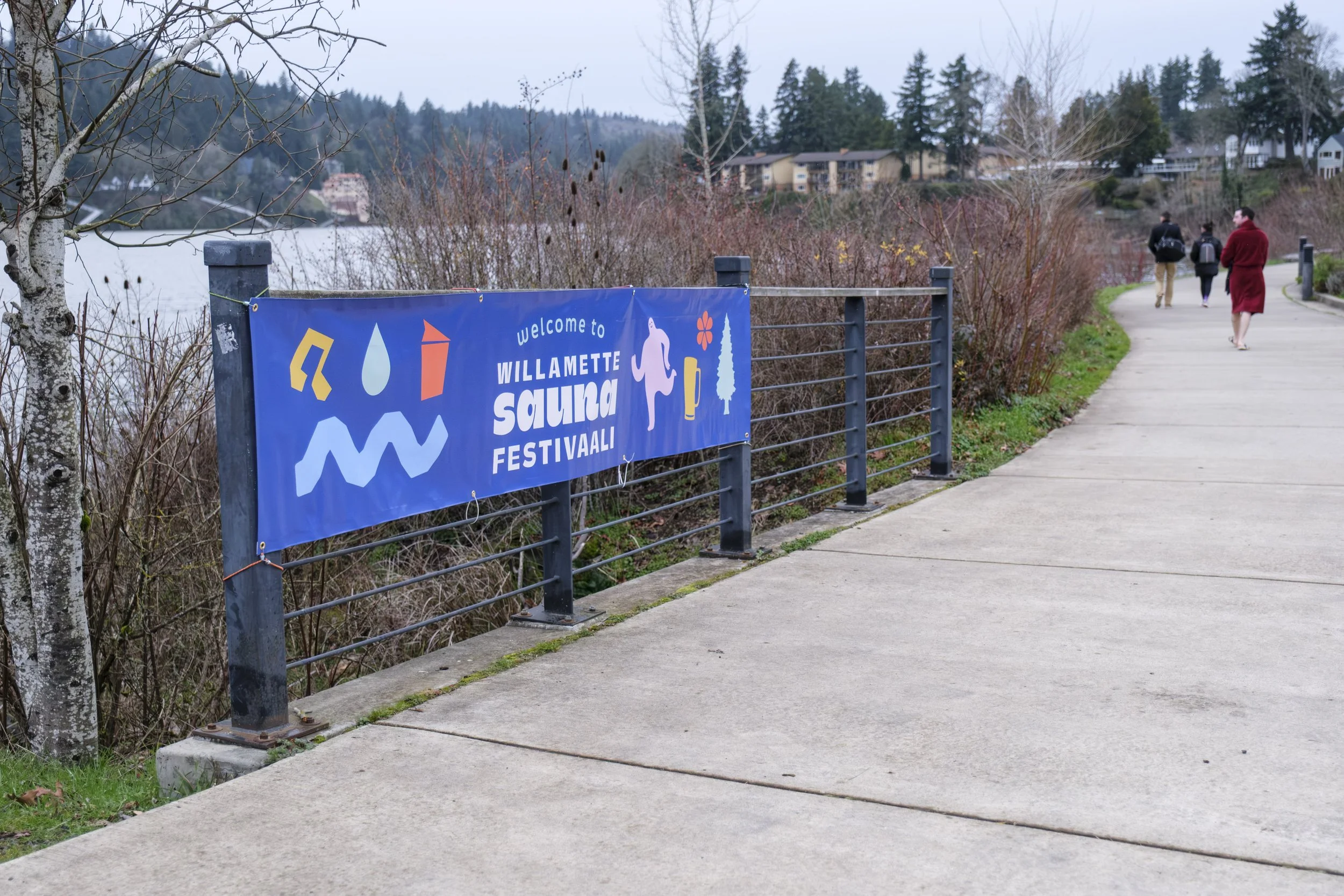
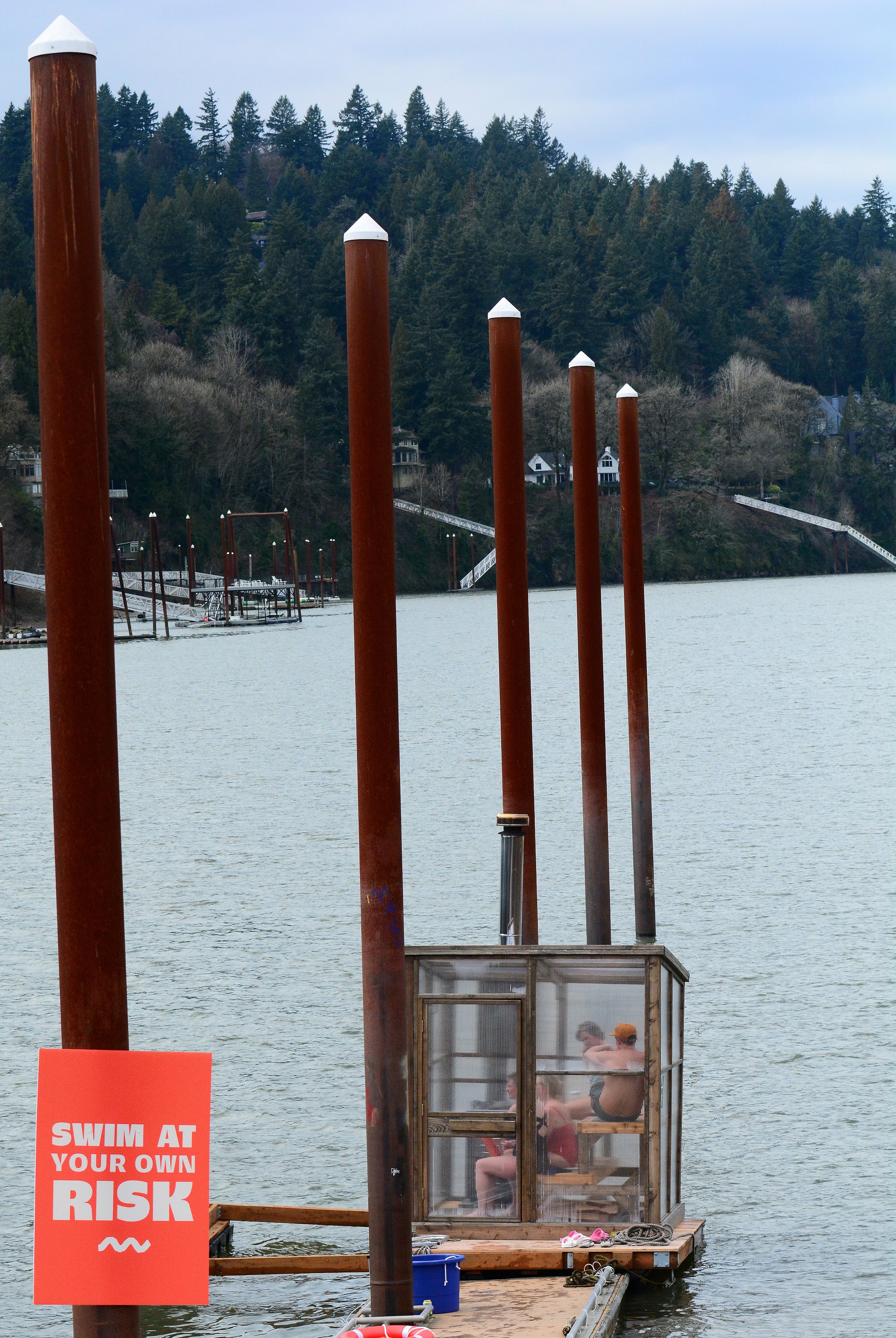
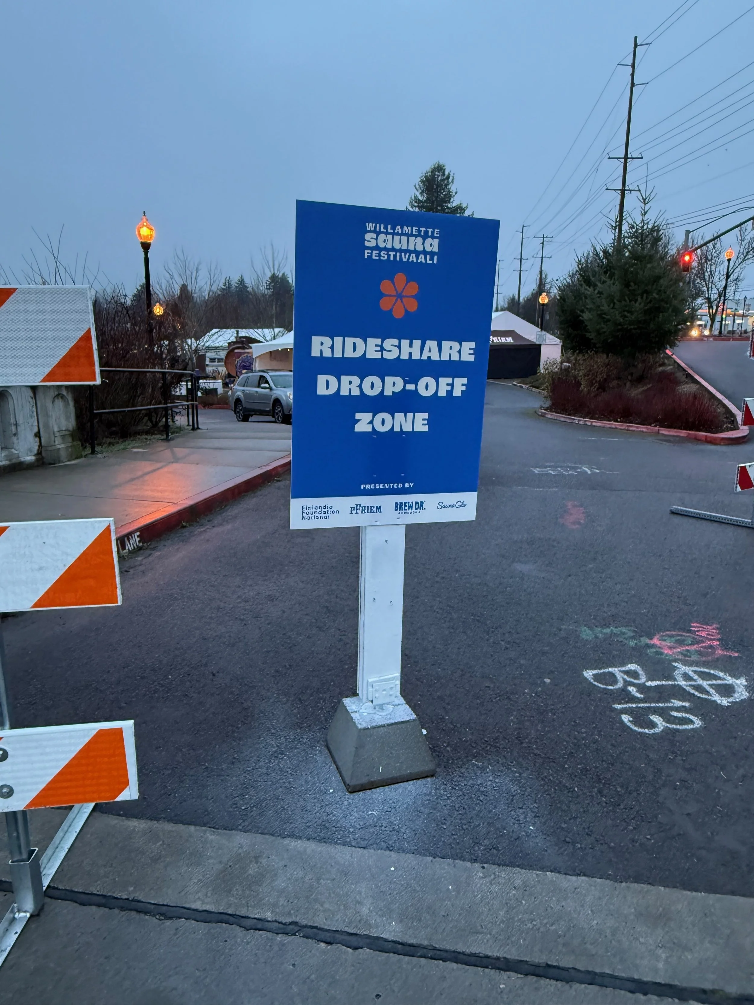
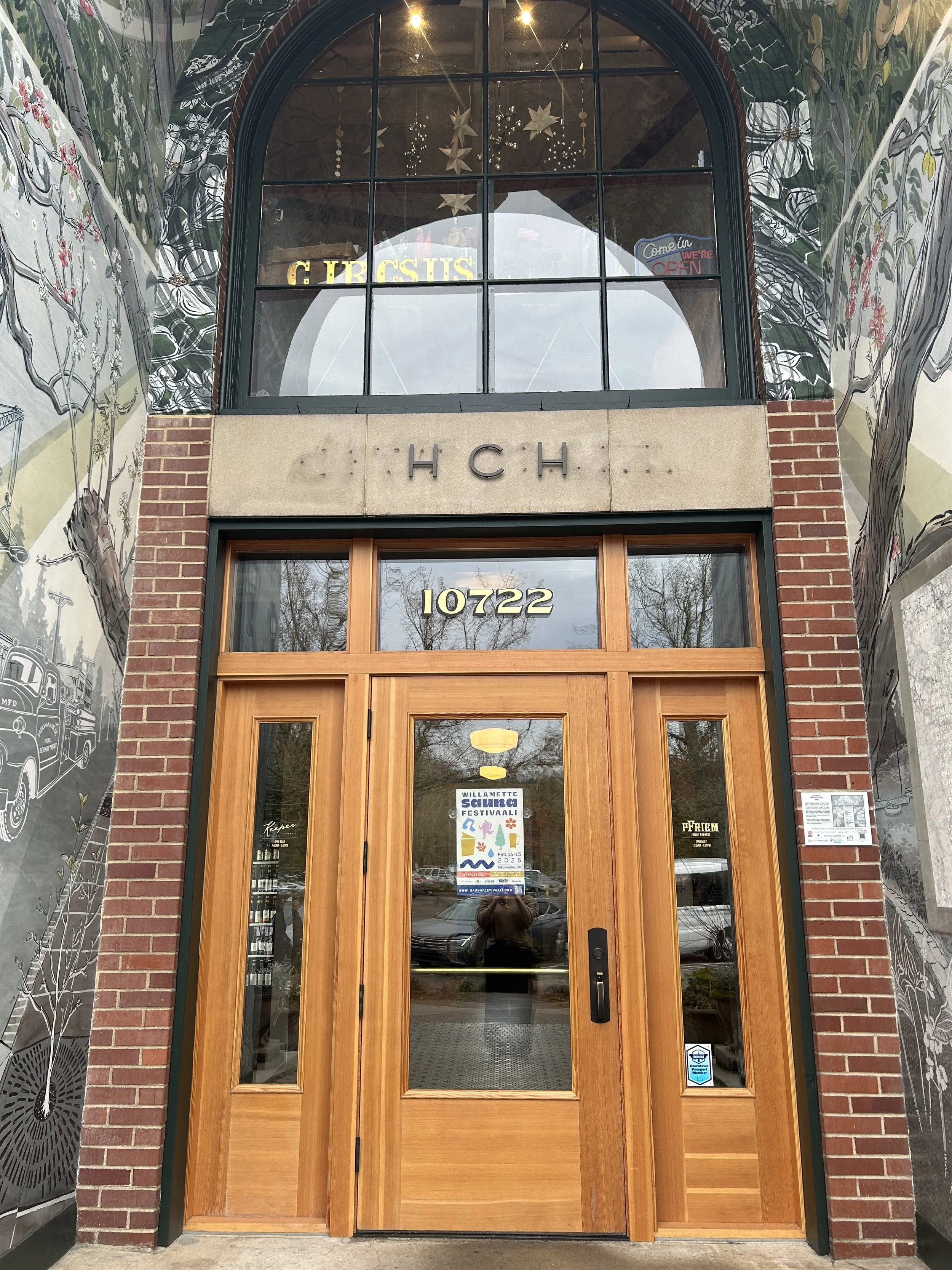
One of the most important features of this brand kit was the ability to communicate a LOT of information both beforehand and onsite to guests. We accomplished this with clearly branded carousels on Instagram, and made sure the website was easily navigable. We also deployed a lot of onsite signage for which I managed all the print vendors, timelines, proofing and production.