Visual Brand Identity: Tidy Design
Brand Brief: Tidy Design
DESIGNED IN CONJUNCTION WITH BALABUUSTA, A WOMAN-OWNED AGENCY HERE IN PORTLAND
THE ASK
THE KICKOFF
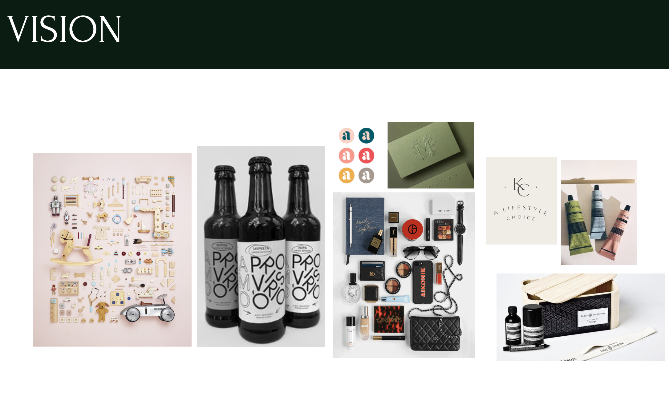
The four of us met in person to discuss business goals, assess competitors in the space, ideal clients, launch timeline, and aesthetic inspirations. While it’s second nature to do everything remotely nowadays, meeting in person was so energizing and allowed for us to bounce so many fun possibilities off one another. We collaborated on developing the brand board (below), and thought of so many exciting applications for the eventual brand. My favorite? A leave-behind candle for preferred clients, sticker-labeled with the eventual TIDY Design logo. That level of high-touch client service felt like a great representation of what the business was trying to achive and we needed the visual identity to match.
A two-woman team in Portland, OR came to us (myself and colleague Dana Alley, a brand marketing maven, operating under the name Balabuusta) looking for support in starting a new business venture together: TIDY Design - a home organization business with a design twist.
Their unique value proposition was that they’d not only provide home organization services, but would also offer design/build packages to create organizational systems and beautify areas of a client’s home with storage options, murals, and more. Their brand needed to be modern, approachable, and yes, *clean*. I’d take the lead on the visual branding and Dana would run point on offering brand strategy, a marketing roll-out package, and consulting on stock photography, web content, and social launch.
We were inspired by intricate flatlays of “exploded” containers, bold labels with jumbled - but clear - letterforms, bright color palettes that still felt calm, and luxe, simple packaging.
The Process
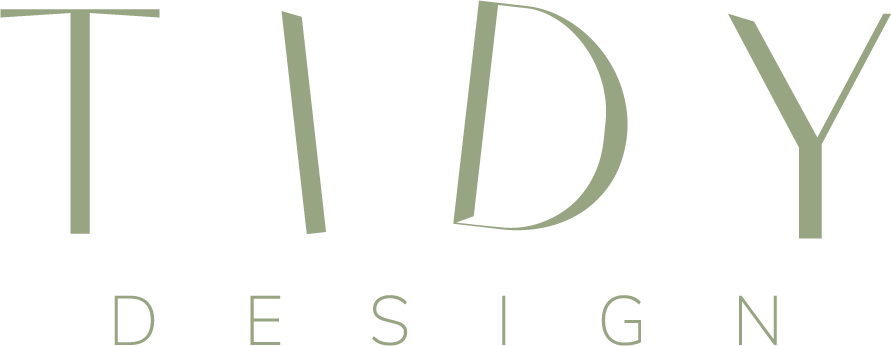
Round 1 feedback also requested a more polished and mature looking typeface for the word “design” which we refined with an all caps treatment. We also went back and forth a bit noodling on if TIDY could survive as a brand name on its own without the “Design” but ultimately decided to keep it. Round 2 went smoothly and after minimal refinements and some mockups to show how it would live in space, the TIDY Design brand was born:
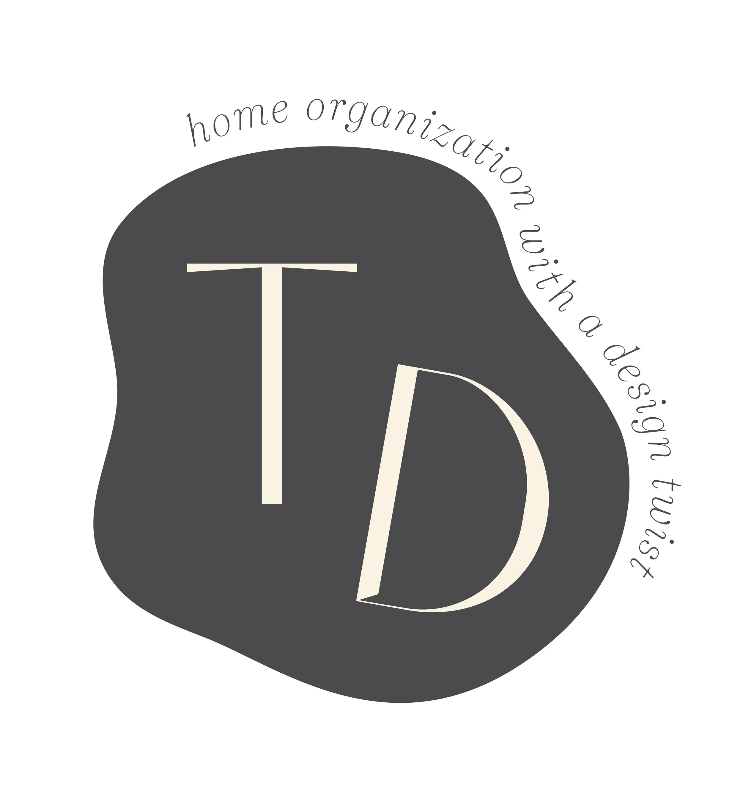
Early on in the design process we found that TIDY wasn’t quite a long enough word in itself to “jumble” in a waterfall shape, and TIDY Design was too long to do it legibly. But we liked the playful juxtaposition of an organization business and the word “tidy” being a little out of sorts, so that came through in each of the Round 1 concepts. We landed on the “splat” shape idea early on and it stuck, representative of an organic mess of something our TIDY Design gals might wipe off a client’s countertop, though we simplified the shape quite a bit.
The FINAL DELIVERY
Part of the package was consultation on how the brand’s Instagram grid would look upon launch. We developed a suite of “splat” icons for the Highlights covers, as well as some content recommendations including a “Tidy Tips” post series, a folder of approved stock imagery, and some beautifully organized flat lay photos.
““So this is awkward…
We barely have any feedback - because we love it!! We really think you addressed the feedback perfectly and feel like the recommended logo is pretty darn perfect. We also think the splat look really good! And really that’s kind of it! We just love it and think it is so perfect and such an incredible blend of fun and polished.
THANK YOU THANK YOU THANK YOU!!!!!!!!!””
